PCA and Brexit

One of my favorite things to do with political datasets is to ideologically scale them. The underlying assumption of scaling is that some high dimensional data is actually a function of a latent variable that we can identify, and one approach to high dimensional scaling is to best identify the dimensions that explain most of the data’s variation. These dimensions are usually not obviously interpretable, so it is up to us to recognize whether they have some inherent meaning and what that meaning could be.
When it comes to politics, one variable that often explains people’s actions is ideology. It is not unreasonable to assume that a lot of political data’s variance can be explained by a latent variable that we might interpret as party affiliation or viewpoint. Ideological scaling, therefore, is projecting some high dimensional political data into a lower dimensional space and interpreting the latent dimensions that are identified as political ideology.
The most famous example of this approach is dw_nominate, which was developed by the political scientists Keith Poole and Howard Rosenthal (Ideology and Congress, 2007). They identified two main dimensions that explain most of the variance in Congressional voting behavior. The construction of their dimensions allowed them to interpret the first dimension as liberal-conservative on economic issues, while the second dimension was interpreted as liberal-conservative on social issues.
Principal Component Analysis
One of my favorite approaches to multidimensional scaling is principal component analysis (PCA), which, unlike dw_nominate, is relatively hands off and doesn’t require fine tuning. In general, PCA is a transformation of the data into a different space such that dimensions of the space being projected onto are orthogonal to each other and the first dimension explains the greatest amount of variance in the data, the second dimension explains the second greatest amount of variance etc.
Let \(X\) be our data matrix and assume that its columns have zero expectation (or simply subtract the column-wise sample mean to make it so). We know that matrix can be decomposed into the product of a diagonal matrix of its singular values \(S\), such that the elements of \(S\) are ordered in descending order, and two orthogonal matrices \(U\) and \(V\), which span its column and row space respectively (a proof of this follows from the Spectral Theorem, but is too technical to include in this blogpost):
\[X = USV^T\]We define \(A\) as \(X^TX\) which we recognize as being proportional to the covariance matrix of \(X\).
\[A = X^TX\]Applying the Singular Value Decomposition to \(X\) we get:
\[\begin{align} A &= X^TX \\ &= (USV^T)^T (USV^T) \\ &= VSU^TUSV^T \\ &= VS^2V^T \end{align}\]Since \(U\) is an orthonormal matrix. (many thanks to Ben Baer for pointing out a small mistake here)
Notice that this is the eigendecomposition of \(A\) where the columns of \(V\) are the eigenvectors and the elements of \(S^2\) are the eigenvalues. We call these the principal components of \(X\).
By definition, we know that eigenvectors are vectors that are only scaled by the original matrix and do not change direction. Therefore, the eigenvectors of \(A\) are the directions in which \(A\) (the covariance of \(X\)) change only by the scalar multiples of the entries of \(S^2\). Directions that are scaled by larger values in \(S^2\) correspond to directions of greater variation. In the high dimensional space (dimensions equaling the number of variables in our dataset) our data lives in, the first eigenvector, which has the largest corresponding eigenvalue, gives us the direction in which our observations change the most. As expected, the second eigenvector is the direction in which they change the second most and so on.
For a more rigorous explanation see the Wikipedia page on PCA.
The Data
The data that I am using is the voting record of the House of Commons from the first round of indicative votes concerning Brexit on March 27th 2019. The votes were undertaken after Theresa May, the British Prime Minister, failed to pass the deal she had negotiated with the European Union (EU), in the House of Commons on two prior occasions. In response, the House took control of the parliamentary timetable (which is usually controlled by the government) and voted on a number of potential Brexit outcomes to see whether any would command a majority (spoiler, none did).
There were eight different options that Members of Parliament (MPs) voted on. On a high level these were:
- No deal – leaving the EU without any deal or future relationship. This would default the United Kingdom to the WTO most favored nation status in relation to the EU.
- Common Market 2.0 – leaving the EU but remain in the European Free Trade Association (EFTA) and the European Economic Area (EEA) and a “comprehensive customs arrangement”.
- EFTA/EEA – without a customs union.
- Customs Union – but without committing to EFTA and EEA.
- Labour’s Plan – this would include a customs union and remaining in close regulatory alignment with the single market. It would also allow the UK to continue to participate in the some EU agencies.
- Revoking Article 50 – this would be effectively halting Brexit for the time being.
- Second Referendum – this would force any deal to be subject to a second public referendum.
- Preferential Arrangement – trying to get preferential trading agreement with the EU, but no specifics on how this might look.
If you want to learn more about these options, The Guardian has a great explainer here.
Historically, parties in the United Kingdom have been powerful and once a vote has been scheduled the government whipping operation is usually successful in passing legislation. Roll call data has therefore not been particularly useful identifying factions within parties. This has, however, not generally been the case for Brexit. For a number of reasons, which I don’t have time to go into here, Brexit has exposed cleavages within parties. In conjunction with indicative votes being free (not whipped), these developments present a unique opportunity to identify party coalitions on this subject.
I downloaded roll call voting data on the eight options from the House of Commons website here.
Analysis
The first step in my analysis was transforming the raw vote results into numerical data, using 1 to represent “aye”, -1 for “nay” and 0 for “no vote recorded.”
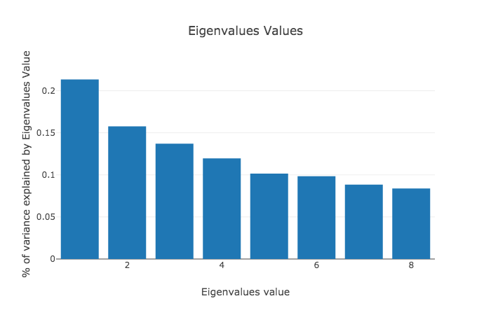
When I apply PCA to a dataset the first thing I usually do is take a look at the magnitude of the eigenvalues values of \(X^TX\). This is because I want to know what the proportion of variance I can expect to see explained by the first few principal components is and whether this dimensionality reduction method is useful in the first place. As we can see in figure 1 in this dataset the first principal component explains a fifth of the variation. While this isn’t as much as I would have hoped, it still seems likely, that plotting the first principal component will be meaningful.
Since the first principal component is so much larger than the second, I start by only plotting that component in figure 2.
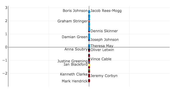
Generally the parties are separable across the y-axis with the Conservatives (blue) and the Democratic Unionist Party (DUP – orange) on the one side and Labour (red), the Scottish National Party (SNP – yellow), the Liberal Democrats (also orange), and the Independent Group (black) on the other.
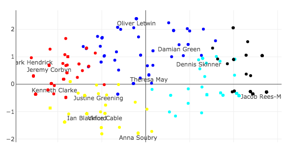
At the top you can see some of the Brexit hardliners such as Boris Johnson and Jacob Rees-Mogg who voted to leave the European Union without a deal. On the other side you can see Jeremy Corbyn, the leader of Labour, who voted for all concrete no deal alternatives except revoking article 50. In the middle, around the origin, you can see Theresa May, who abstained on all options.
A few more interesting MPs to note are Graham Stringer and Dennis Skinner who are both members of the Labour party but support leaving the European Union and can be found close to the Conservative party and Kenneth Clarke, a member of the Conservative Party who is generally seen as a “soft leaver” and can be found in the middle of the Labour party on this issue.
Closer to Labour than the Conservatives, you can also find Vince Cable, the leader of the Liberal Democrats, and Ian Blackford the leader of the SNP, together with Justine Greening, a Conservative and another “soft-leaver.” The Liberal Democrats and the SNP are generally seen as wanting to reverse Brexit and both parties voted to revoke article 50. However, Jeremy Corbyn (and a lot of the Labour party) abstained on that vote.
It is interesting to see in figure 2 that Labour’s position on a “soft Brexit” is further away from the hard Brexiteers than revoking article 50 and not leaving at all. This is due to tactical voting (Corbyn abstaining on revoking article 50, the SNP abstaining on the Customs Union) and the fact that PCA has no inherent concept of ideology and simply tries to explain variation. It also suggests that this first principal component is not telling the full story.
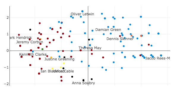
In figure 3, you can see what happens when I plot the first two principal components against each other. The fact that Oliver Letwin (Conservatives) and Anna Soubry (The Independent Group, formerly Conservatives) are no longer close to each other (as they were in figure 2) further suggests that the second principal component is meaningful.
In figure 4, I plot the second principal component in isolation, but it is not obvious to me what this component represents.
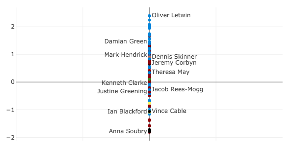
If you have any ideas what this dimension may illustrate please send me an email.
In figure 3, you can start to make out groups of MPs that are close together. I then partitioned the data into clusters in order to see whether I could interpret what these groups could mean.
In general, my go-to approach in clustering is the k-means algorithm. The idea of the algorithm is simple. You start by determining how many clusters you are interested in identifying. The centers of each of the clusters (centroids) are initialized randomly. The algorithm then assigns every data point to its closest centroid and recalculates the centroids position as the mean of all the data points assigned to it. This procedure of assigning data points and re-calculating the centroid position is repeated until the positions of the centroids no longer change. You can read more here.
While k-means is guaranteed to converge, we have no guarantees on it finding the optimal partition of the data points. Generally, it depends on the initialization (which is why we often try this algorithm with a number of different randomly generated starting points) and how many clusters we want to partition the data into. There are some heuristics we can use to try and determine the number of clusters to use, but I arbitrarily decided to use 5 for this analysis.
In figure 5, you can see the five clusters that were identified by the algorithm. As before, it is not obvious what the clusters represent. My intuition suggests that the black cluster represents the hard Brexiteers. The dark blue cluster is the Conservative Government and its allies. The light blue cluster are soft Brexiteers. The red cluster is Labour and its allies and the yellow cluster are the Remainers. I would be very happy to hear other explanations, so please feel free to email me.
Another way to look at our data would be to look at ideological differences in the Brexit options that were voted on. This could be a mental model for how extreme the different possibilities are, and whether there are any potential consensus options. To do that, we can simply apply PCA to the transpose of our vote matrix.
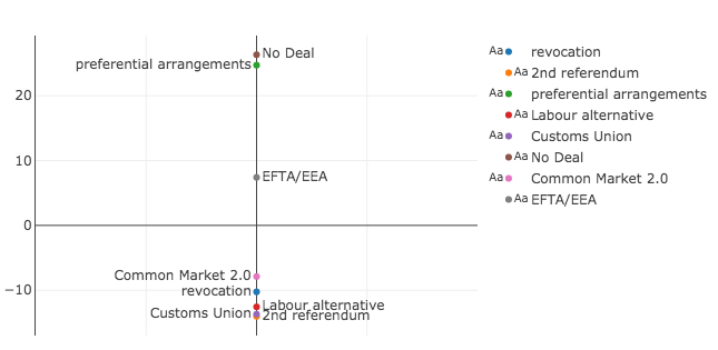
In figure 6 we can see no deal and preferential arrangements on one extreme end and a second referendum, the Labour alternative and a customs union on the other. The Common Market 2.0 and revoking article 50 are close to the Labour alternative and the EFTA/EEA option is in the middle.
Similarly to figure 2, it seems strange that revoking article 50 (and therefore temporarily halting Brexit) is not a more extreme option than a second referendum or the Labour alternative. But, as above, this has more to do with tactical voting and the fact that this is not a perfect model for ideology.
Furthermore, figure 6 suggests that EFTA/EEA may be a compromise option for the House of Commons. Amusingly this option was voted down with the largest margin (64 for and 377 against), so its position in the middle only suggests that nearly everyone can agree that they are against it.
Finally, I was curious what would happen if I plotted the first and second principal components of the Brexit options against each other, the same way I did for the MPs.
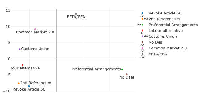
It is not obvious to me what this second dimension would represent. Furthermore, you can see the presence of a horseshoe, which is evidence that the second dimension is simply a folded function of the first dimension. This suggests that the second dimension isn’t particularly meaningful. I don’t fully understand why the horseshoe appears in these cases, but you can read more here and here. If you have a good understanding of why this effect appears, please send me an email.
Conclusion
Scaling the indicative votes gave us interesting insights into the different camps of the Brexit argument. This was especially true for the factions that exist in the Conservative party between the government loyalists, the hard Brexiteers and the soft Brexiteers. Furthermore, we could see two distinct camps in the opposition between the Labour Party, who generally support leaving but want a second referendum, and the smaller opposition parties like the SNP and the Liberal Democrats who want to revoke article 50.
This kind of exploratory analysis generally leads to more unanswered questions. Some of those I find most compelling are what the second dimension could represent and whether there is a better interpretation for the light blue cluster that appears in k-means.
Finally, please remember that this is simply a model that gives us one way of looking at the data. The analysis’ failure when it comes to tactical voting is only one example of why this model isn’t perfect. To quote the well known maxim: “All models are wrong, but some are useful.”
Please let me know if you spot any mistakes or have any alternative explanations.